Mobile optimization has become crucial for businesses in today's digital age. A large number of people now browse the internet on their mobile devices, and as a result, it's essential for websites to be optimized for mobile to provide a positive user experience.
A website that is not optimized for mobile can lead to poor user experience and frustration, which can result in a higher bounce rate and fewer conversions. Search engines like Google, now use mobile-first indexing, meaning that mobile versions of websites are indexed before desktop versions. Therefore, it is more important than ever to optimize the mobile version of a website to improve search engine rankings.
Mobile optimization goes beyond just making sure a website can be viewed on a mobile device, it involves ensuring that all elements of the website are optimized for mobile. This includes layout, navigation, text size, and image size.
In short, mobile optimization should not be an afterthought for businesses. With a large number of people browsing the internet on mobile devices, it's crucial for websites to be optimized for mobile to provide a positive user experience and improve the SEO ranking.
Run through common mistakes businesses make when optimizing their websites for mobile. We have provided some prompts below:
One design does not fit all
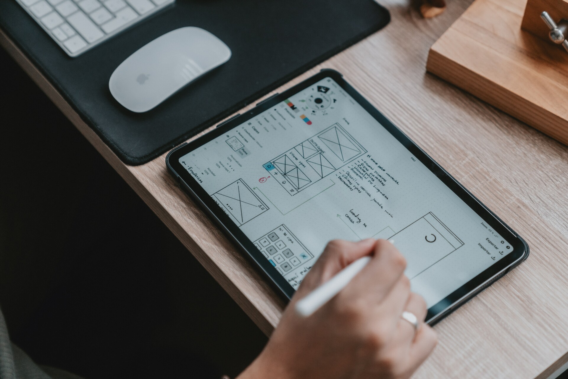
It's important to understand that one design does not fit all and that a design that looks great on a desktop screen may not work well on a mobile device. A common mistake is to simply take a desktop design and squish it down to fit on a mobile device, without considering the unique needs and constraints of mobile users.
A good mobile-optimized design takes important visual elements from the desktop design while cutting back on unnecessary ones. This includes simplifying the layout, increasing the size of buttons, and making sure the text is easily readable on a smaller screen. Navigation should be streamlined, and only the most essential elements should be included.
It's also important to consider the different ways that people interact with a website on mobile devices compared to desktops. For example, on a mobile device, users are more likely to use their fingers to navigate, so buttons and links should be large enough to tap with a finger. Mobile users may have limited internet connectivity and may be looking for quick access to specific information, so it is important to prioritize the most important information on the mobile version of the website.
A good mobile-optimized design takes into account the unique needs and constraints of mobile users, while still keeping the most important visual elements from the desktop design. It is important to not just squish down a desktop design but to simplify and streamline the layout for a better user experience on mobile devices.
Overcomplicated menus
Navigation is crucial on a mobile device because it needs to be used with a literal touch of the finger. It's important to remember that users don't have the dexterity of a mouse click, or a large screen to scroll through details.
One common mistake in mobile design is using overcomplicated menus. Having too many options or nested submenus can be confusing and difficult to use on a small screen with touch navigation. It's essential to keep the navigation simple and intuitive, with only the most essential options included.
To avoid overcomplicated menus, businesses can use a hamburger menu, which condenses the navigation into a single button, keeping the interface clean and uncluttered. This approach allows users to access the navigation options when they need them but keeps them hidden when not in use.
Another approach is to use a simple and clear navigation bar that is always visible on the screen. This allows users to quickly access the most important sections of the website with minimal effort.
Navigation is crucial on mobile devices, and it's important to keep it simple and intuitive. Overcomplicated menus can be confusing and difficult to use on small screens, and businesses should aim to use simple and clear navigation options that are easy to access with a touch of the finger.
Button size
Button size is an important factor to consider when optimizing a website for mobile devices. On a desktop, a mouse click is used to interact with buttons, but on a mobile device, a finger tap is used. It's important to make sure that buttons are large enough to be easily tapped with a finger.
One common mistake in mobile design is not adjusting button sizes to accommodate a finger tap. Buttons are one of the most important elements on a website, and they are often used to navigate, make a purchase, or complete a form. If buttons are too small or difficult to tap, it can lead to frustration and a poor user experience.
To ensure that buttons are finger-friendly, businesses should make sure that buttons are large enough to be easily tapped, with a minimum size of around 44x44 pixels. The text within the button should be large enough to be easily read on a small screen, and there should be enough space around the button to make it easy to tap.
Button size is an important factor to consider when optimizing a website for mobile devices. It's important to make sure buttons are large enough to be easily tapped with a finger and that text within the button is also large enough to be easily read on a small screen. This will ensure that the user has a positive experience and can easily interact with the website.
Elements too close together
Space is crucial between touch targets when designing a website for mobile devices. When elements are too close together, it increases the likelihood of the wrong element being tapped when a user tries to interact with them. This can lead to confusion and frustration for the user, and can negatively impact the overall user experience.
When designing for mobile, it is important to ensure that there is enough space between touch targets, such as buttons and links, to prevent accidental taps. This can be achieved by using appropriate padding and margins around elements.
Another important consideration is the size of touch targets. Small touch targets, such as small buttons or links, can be difficult to tap accurately on a small screen. It's important to make sure that touch targets are large enough to be easily tapped with a finger.
Space is crucial between touch targets when designing a website for mobile devices. Ensuring that there is enough space between touch targets can prevent accidental taps and improve the overall user experience. It is also important to make sure that touch targets are large enough to be easily tapped with a finger.
Using oversized images
Using oversized images can negatively impact the performance of a website on mobile devices. Large file sizes can result in a slow load time, which can lead to a poor user experience. Slow load times can cause users to lose patience and leave the website before it fully loads, resulting in a high bounce rate.
When designing for mobile, it's important to optimize images by compressing them and reducing their file size. This can be done by using image compression tools or by adjusting the resolution and quality of the images.
For example, an image with a resolution of 3000x2000 pixels and a file size of 2MB, can be resized to 1200x800 pixels and a file size of 300KB, without losing much of the quality. This will greatly improve the load time without significantly affecting the quality of the image.
Another approach is to use responsive images, which automatically adjust to the size of the device, thus reducing the load time, while keeping the quality of the image.
In summary, using oversized images can negatively impact the performance of a website on mobile devices. It's important to optimize images by compressing them and reducing their file size to improve the load time and provide a better user experience. By using responsive images, you can maintain the quality of the image, while reducing the load time.
No testing
Testing is vital to ensuring a mobile-optimized website is running smoothly. It's often a step that is completed too hastily, but it's important to take the time to thoroughly test the website to ensure that it is functioning as intended.
When testing a mobile-optimized website, there are several things to look for:
- Load time
Test the website's load time on different mobile devices and internet speeds to ensure that it is loading quickly and efficiently.
- Navigation
Test the navigation to ensure that it is easy to use and intuitive. Make sure that all links and buttons are working correctly.
- Touch targets
Test touch targets, such as buttons and links, to ensure that they are large enough to be easily tapped with a finger and that there is enough space between them to prevent accidental taps.
- Images
Test images to ensure that they are optimized for mobile and that they are loading quickly and correctly.
- Responsiveness
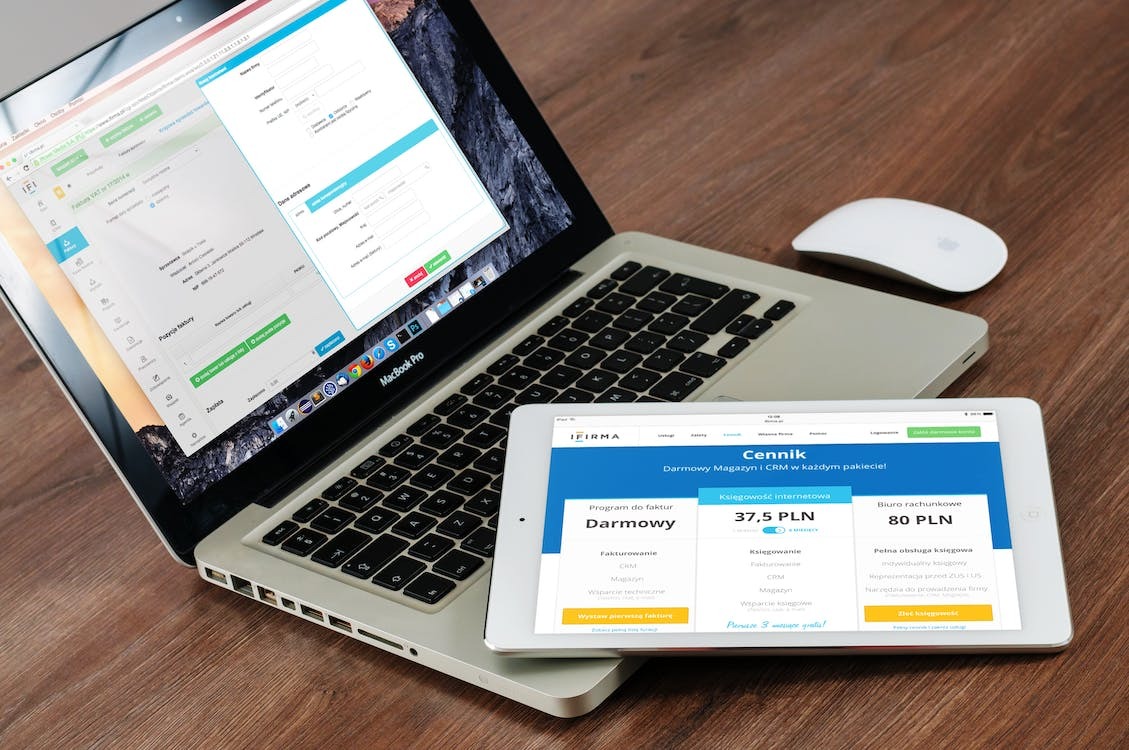
Test the website's responsiveness to ensure that it looks and functions correctly on different screen sizes and resolutions.
- Compatibility
Test the website on different mobile browsers and operating systems to ensure that it is compatible and working correctly.
- Usability
Test the website's usability by having users perform a series of tasks, and gather feedback to identify areas that could be improved.
Testing is vital to ensure a mobile-optimized website is running smoothly. It's important to take the time to thoroughly test the website and look for things such as load time, navigation, touch targets, images, responsiveness, compatibility, and usability to ensure that it is functioning as intended.


